Topics List
Design Elements

TextFields
Enhancing User Input with Text Fields

Text fields are essential components of app interfaces, enabling users to input text, numbers, or other data. They are commonly used for forms, search bars, and other interactive elements. Text fields can be customized in terms of size, style, and behavior to suit the app´s design and functionality. They play a crucial role in providing a seamless user experience, allowing users to interact with the app easily and efficiently. Proper use of text fields can improve the usability and accessibility of an app, making it more user-friendly and intuitive.


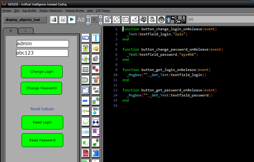
In Kenzie, managing textfields is made convenient with a unified approach similar to that of labels. The same commands, _Text and _Get_Text, used for labels can also be applied to textfields. This consistency simplifies coding significantly, as developers do not need to learn and remember multiple commands for different types of objects. Whether you´re working with labels or textfields, the same commands can be used, enhancing code readability and reducing the chances of errors. This uniformity in handling display objects streamlines the development process, making it more efficient and intuitive.
You can download the project from the following link:

Class_Rar_0__24.rar

Textfield Properties


During design mode, you can assign the following properties and events to a Textfield:


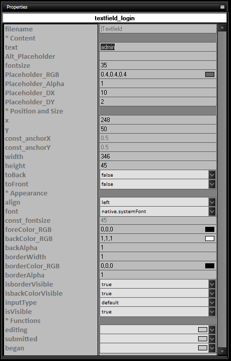
Here is the list of properties and their usage for Textfields:
  • name: The name of the TextField.

  • Content

    • text: The initial text content of the TextField.

    • Alt_Placeholder: The alternative text to display when the TextField is empty.

  • Position and Size

    • x: The x-coordinate position of the TextField.

    • y: The y-coordinate position of the TextField.

    • const_anchorX: The x-anchor point of the TextField.

    • const_anchorY: The y-anchor point of the TextField.

    • width: The width of the TextField.

    • height: The height of the TextField.

    • toBack: Set to true to move the TextField to the back layer.

    • toFront: Set to true to move the TextField to the front layer.

  • Appearance

    • align: The horizontal alignment of the text within the TextField (left, center, right).

    • font: The font style of the text.

    • fontsize: The font size of the text.

    • foreColor_RGB: The RGB color of the text foreground.

    • backColor_RGB: The RGB color of the TextField background.

    • backAlpha: The alpha transparency of the TextField background.

    • borderWidth: The width of the TextField border.

    • borderColor_RGB: The RGB color of the TextField border.

    • borderAlpha: The alpha transparency of the TextField border.

    • isborderVisible: Set to true to make the TextField border visible.

    • isbackColorVisible: Set to true to make the TextField background color visible.

    • inputType: The type of input expected in the TextField (default, number, decimal, phone, url, email, no-emoji).

    • isVisible: Set to true to make the TextField visible.

  • Functions

    • editing: The function to execute when the TextField is being edited.

    • submitted: The function to execute when editing is submitted.

    • began: The function to execute when editing begins.