| Topics List |
| Design Elements |
| TextBoxes |
| Managing Multi-line Text with Text Boxes |
Text boxes are versatile elements used to display and edit multi-line text in apps. They provide users with a larger area to input or view text, making them ideal for tasks like composing messages, writing notes, or entering lengthy content. Text boxes can be customized with features like scrollbars, text wrapping, and text formatting options to enhance the user experience. They are essential for apps that require users to input or view substantial amounts of text, offering a convenient and user-friendly way to interact with the app´s content.
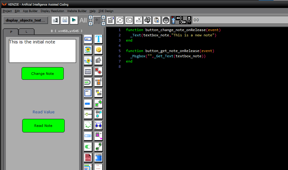 In the example included, textboxes are manipulated using the _Text() and _GetText() commands, just like textfields and labels. This uniformity in handling different types of UI elements simplifies coding and makes it more intuitive. When setting text to a textbox, the _Text() command is used, followed by the textbox object and the desired text. For example, _Text(textbox_object, ''New text here'') will set the text of the specified textbox to ''New text here''. Similarly, to retrieve the text from a textbox, the _GetText() command is used, passing the textbox object as an argument. This retrieves the current text content of the textbox. The benefit of this approach is that developers can use consistent commands across various UI elements, reducing the need to remember and differentiate between different methods for different elements. This can lead to faster development and easier maintenance of the codebase. You can download the project from the following link: Class_Rar_0__25.rar Textbox PropertiesDuring design mode, you can assign the following properties and events to a Textbox: 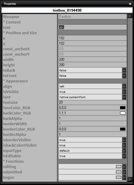 Here is the list of properties and their usage for Textboxes:
|