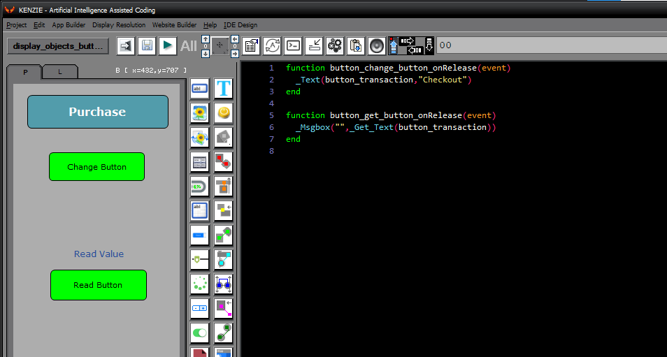
Buttons are fundamental components of app interfaces, serving as clickable elements that trigger actions or navigate to different parts of the app. They play a crucial role in enhancing user interaction by providing clear visual cues for actions and enabling users to navigate through the app´s features. Buttons can be customized with various styles, sizes, and colors to match the app´s design theme and improve usability. They are essential for creating intuitive user interfaces that encourage user engagement and streamline navigation within the app.
You can download the project from the following link:
Class_Rar_0__26.rar
Button Properties
During design mode, you can assign the following properties and events to a Button:
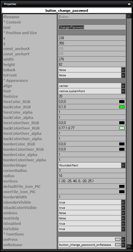
Here is the list of properties and their usage for Buttons:
- name: The name of the Button.
- Content
- text: The text content of the Button.
- Position and Size
- x: The x-coordinate position of the Button.
- y: The y-coordinate position of the Button.
- const_anchorX: The x-anchor point of the Button.
- const_anchorY: The y-anchor point of the Button.
- width: The width of the Button.
- height: The height of the Button.
- toBack: Set to true to move the Button to the back layer.
- toFront: Set to true to move the Button to the front layer.
- Appearance
- align: The horizontal alignment of the text within the Button (left, center, right).
- font: The font style of the text.
- fontsize: The font size of the text.
- foreColor_RGB: The RGB color of the text foreground.
- backColor_RGB: The RGB color of the Button background.
- backColor_alpha: The alpha transparency of the Button background.
- foreColor_alpha: The alpha transparency of the Button foreground.
- foreColorOver_RGB: The RGB color of the text foreground when the Button is in the ''over'' state.
- backColorOver_RGB: The RGB color of the Button background when the Button is in the ''over'' state.
- foreColorOver_alpha: The alpha transparency of the text foreground when the Button is in the ''over'' state.
- backColorOver_alpha: The alpha transparency of the Button background when the Button is in the ''over'' state.
- borderColor_RGB: The RGB color of the Button border.
- borderColor_alpha: The alpha transparency of the Button border.
- borderColorOver_RGB: The RGB color of the Button border when the Button is in the ''over'' state.
- borderColorOver_alpha: The alpha transparency of the Button border when the Button is in the ''over'' state.
- borderWidth: The width of the Button border.
- borderShape: The shape of the Button border (Rounded Rect, Rect, Circle, Polygon, Images).
- cornerRadius: The corner radius of the Button for rounded rectangle shapes.
- radius: The radius of the Button for circle shapes.
- vertices: The vertices of the Button for polygon shapes.
- defaultFile_icon_PIC: The default icon file for the Button.
- overFile_icon_PIC: The icon file for the Button when in the ''over'' state.
- isborderVisible: Set to true to make the Button border visible.
- isbackColorVisible: Set to true to make the Button background color visible.
- emboss: Set to true to apply an embossed effect to the Button.
- textOnly: Set to true to display only text without background or border.
- isEnabled: Set to true to enable the Button for interaction.
- isVisible: Set to true to make the Button visible.
- Functions
- onPress: The function to execute when the Button is pressed.
- onRelease: The function to execute when the Button is released after being pressed.
|