| Topics List |
| Design Elements |
| ProgressBars |
| Visual Progress Tracking with Progress Bars |
|
Progress bars are graphical elements used to visualize the progression of a task or process. In app development, progress bars are often used to indicate loading times, file download progress, or completion of a task. They provide users with a visual cue, informing them about the status of an operation and how much time is remaining. Progress bars can be customized in terms of color, size, and style to match the overall design of the app. They are a useful tool for enhancing user experience and improving the overall usability of an app.
In the following example, we demonstrate downloading an MP3 file while monitoring its progress. A progress bar visually represents the incremental download progress to the user. Upon completion, the downloaded MP3 file automatically begins playing. 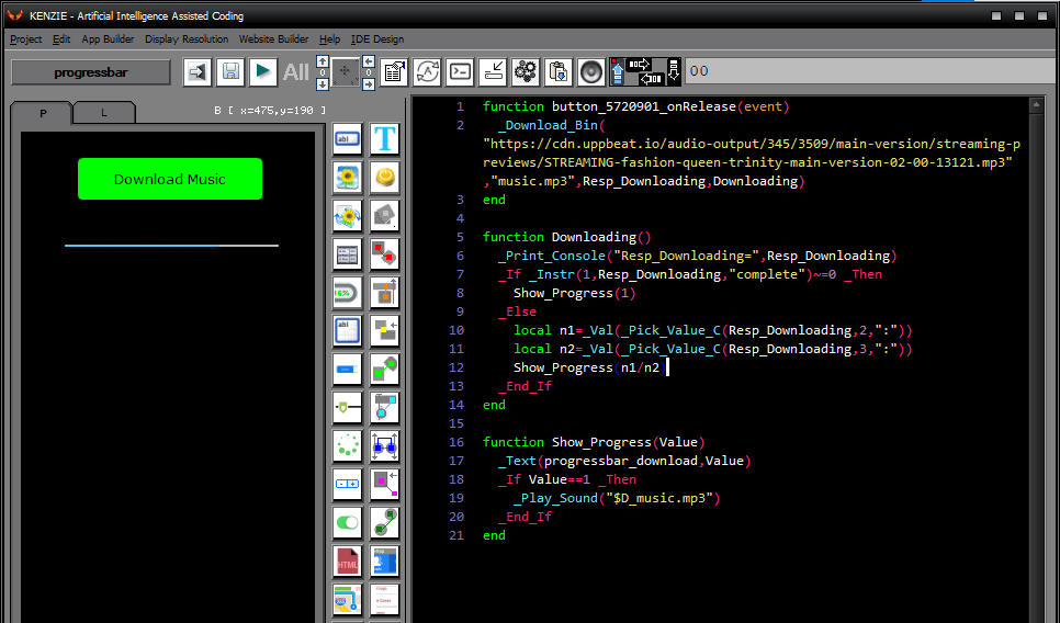 You can download the project from the following link: Class_Rar_0__32.rar ProgressBar´s PropertiesDuring design mode, you can assign the following properties and events to a ProgressBar: 
|