Segmented controls are UI elements that allow users to make selections from a predefined set of options. They are often used to toggle between different views or modes within an app. Segmented controls are visually appealing and easy to use, making them ideal for organizing content and improving user interaction. With segmented controls, app developers can provide users with clear and intuitive ways to navigate through an app´s features and functionalities.
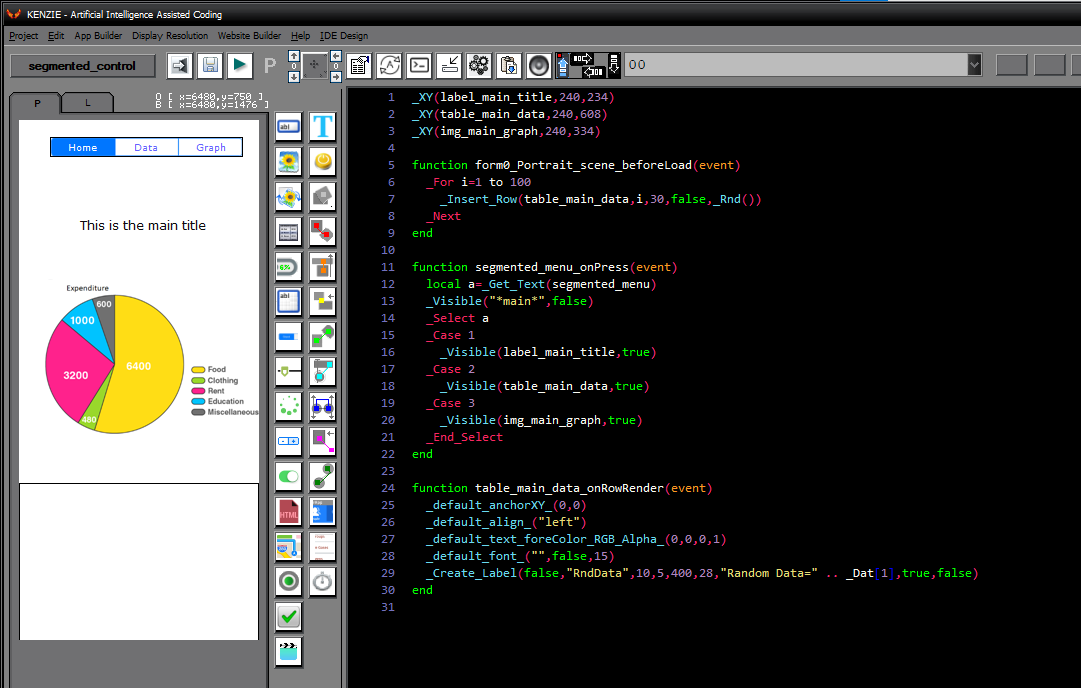
You can download the project from the following link:
Class_Rar_0__33.rar
You can observe the project in motion here:
Segmented Control´s Properties
During design mode, you can assign the following properties and events to a Segmented Control:
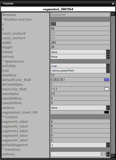
- name: The name of the segmented control.
- Position and Size
- x: The x-coordinate of the segmented control.
- y: The y-coordinate of the segmented control.
- const_anchorX: The anchor point on the x-axis.
- const_anchorY: The anchor point on the y-axis.
- width: The width of the segmented control.
- height: The height of the segmented control.
- toBack: Set to true to move the segmented control to the back.
- toFront: Set to true to move the segmented control to the front.
- Appearance
- isVisible: Set to true to make the segmented control visible.
- font: The font of the segmented control labels.
- labelSize: The size of the segmented control labels.
- defaultColor_RGB: The default color of the segmented control labels.
- defaultAlpha: The default alpha value of the segmented control labels.
- overColor_RGB: The color of the segmented control labels when hovered over.
- overAlpha: The alpha value of the segmented control labels when hovered over.
- labelXOffset: The horizontal offset of the segmented control labels.
- labelYOffset: The vertical offset of the segmented control labels.
- emboss: Set to true to apply an embossed effect to the segmented control.
- segmented_sheet_PIC: The image for the segmented control.
- Content
- segment1_label: The label for segment 1.
- segment2_label: The label for segment 2.
- segment3_label: The label for segment 3.
- segment4_label: The label for segment 4.
- segment5_label: The label for segment 5.
- defaultSegment: The default segment of the segmented control.
- Functions
- onPress: The function to execute when a segment is pressed.
|