Tab bars are a common UI element used to organize and present multiple views or sections within an app. They typically consist of a row of tabs, each representing a different view or category. Tab bars are useful for providing users with quick access to different parts of an app, allowing them to navigate seamlessly between sections. By using tab bars, app developers can create an intuitive and user-friendly navigation experience, enhancing the overall usability of their apps.
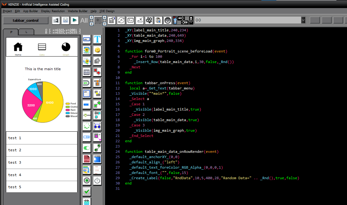
You can download the project from the following link:
Class_Rar_0__34.rar
You can observe the project in motion here:
TabBar´s Properties
During design mode, you can assign the following properties and events to a TabBar:
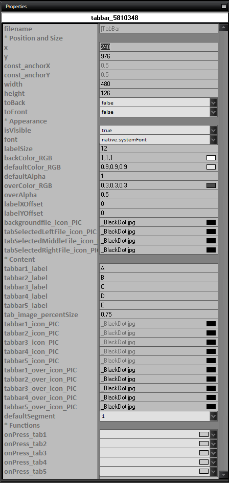
- name: The name of the TabBar control.
- Position and Size
- x: The x-coordinate of the TabBar control.
- y: The y-coordinate of the TabBar control.
- const_anchorX: The anchor point on the x-axis.
- const_anchorY: The anchor point on the y-axis.
- width: The width of the TabBar control.
- height: The height of the TabBar control.
- toBack: Set to true to move the TabBar control to the back.
- toFront: Set to true to move the TabBar control to the front.
- Appearance
- isVisible: Set to true to make the TabBar control visible.
- font: The font of the TabBar control labels.
- labelSize: The size of the TabBar control labels.
- backColor_RGB: The background color of the TabBar control.
- defaultColor_RGB: The default color of the TabBar control labels.
- defaultAlpha: The default alpha value of the TabBar control labels.
- overColor_RGB: The color of the TabBar control labels when hovered over.
- overAlpha: The alpha value of the TabBar control labels when hovered over.
- labelXOffset: The horizontal offset of the TabBar control labels.
- labelYOffset: The vertical offset of the TabBar control labels.
- backgroundfile_icon_PIC: The background image for the TabBar control.
- tabSelectedLeftFile_icon_PIC: The image for the left side of the selected tab.
- tabSelectedMiddleFile_icon_PIC: The image for the middle part of the selected tab.
- tabSelectedRightFile_icon_PIC: The image for the right side of the selected tab.
- Content
- tabbar1_label: The label for tab 1.
- tabbar2_label: The label for tab 2.
- tabbar3_label: The label for tab 3.
- tabbar4_label: The label for tab 4.
- tabbar5_label: The label for tab 5.
- tab_image_percentSize: The percentage size of the tab images.
- tabbar1_icon_PIC: The image for tab 1.
- tabbar2_icon_PIC: The image for tab 2.
- tabbar3_icon_PIC: The image for tab 3.
- tabbar4_icon_PIC: The image for tab 4.
- tabbar5_icon_PIC: The image for tab 5.
- tabbar1_over_icon_PIC: The image for tab 1 when hovered over.
- tabbar2_over_icon_PIC: The image for tab 2 when hovered over.
- tabbar3_over_icon_PIC: The image for tab 3 when hovered over.
- tabbar4_over_icon_PIC: The image for tab 4 when hovered over.
- tabbar5_over_icon_PIC: The image for tab 5 when hovered over.
- defaultSegment: The default segment of the TabBar control.
- Functions
- onPress_tab1: The function to execute when tab 1 is pressed.
- onPress_tab2: The function to execute when tab 2 is pressed.
- onPress_tab3: The function to execute when tab 3 is pressed.
- onPress_tab4: The function to execute when tab 4 is pressed.
- onPress_tab5: The function to execute when tab 5 is pressed.
|