Topics List
Design Elements

Slider
Slide into Precision with Sliders

Sliders are UI elements that allow users to select a value from a range by dragging a handle along a track. They are commonly used for settings where the user needs to select a value within a specified range, such as volume controls or brightness settings. Sliders provide a visual representation of the selected value and allow for precise adjustments. They are intuitive to use and can enhance the user experience by providing a more interactive way to control settings.


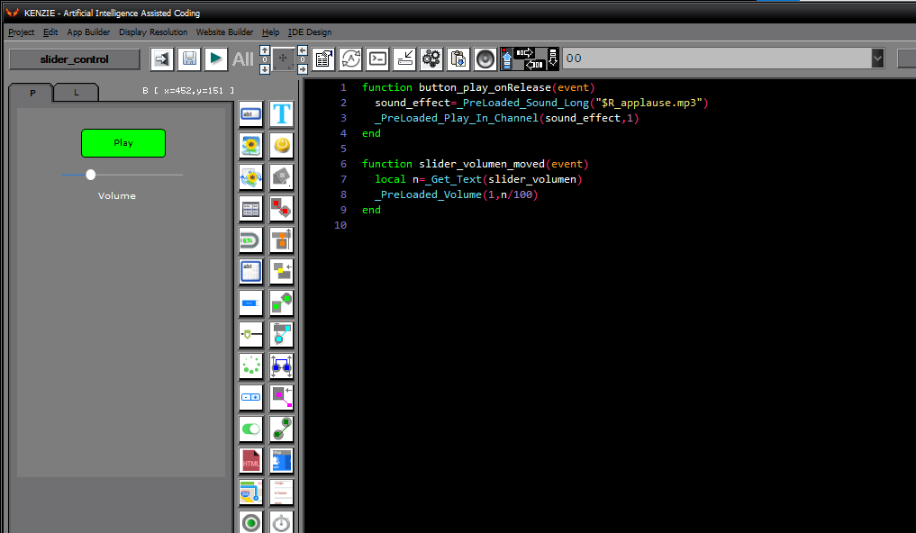
You can download the project from the following link:

Class_Rar_0__35.rar

You can see what the project looks like when it´s running.
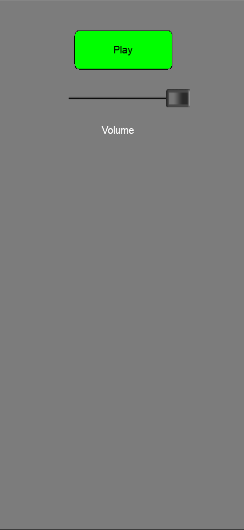


Slider´s Properties


During design mode, you can assign the following properties and events to a Slider:
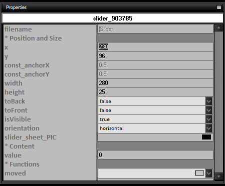


  • name: The name of the Slider control.

  • Position and Size

    • x: The x-coordinate of the Slider control.

    • y: The y-coordinate of the Slider control.

    • const_anchorX: The anchor point on the x-axis.

    • const_anchorY: The anchor point on the y-axis.

    • width: The width of the Slider control.

    • height: The height of the Slider control.

    • toBack: Set to true to move the Slider control to the back.

    • toFront: Set to true to move the Slider control to the front.

    • isVisible: Set to true to make the Slider control visible.

    • orientation: The orientation of the Slider control (horizontal or vertical).

    • slider_sheet_PIC: The image for the Slider control.

  • Content

    • value: The initial value of the Slider control.

  • Functions

    • moved: The function to execute when the Slider control is moved.