Topics List
Design Elements

Spinner
Waiting in Style: Spinner Animation

Spinners, often used to indicate loading or processing, feature a rotating animation that provides visual feedback to users while they wait. This animation, usually a spinning circle or similar shape, signifies that a task is in progress, keeping users informed and engaged. By incorporating a spinner animation, apps can enhance their user interface, providing a seamless and informative experience during loading times.


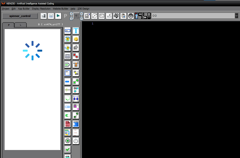
You can download the project from the following link:

Class_Rar_0__36.rar

You can observe the project in motion here:


Spinner“s Properties


During design mode, you can assign the following properties and events to a Spinner:
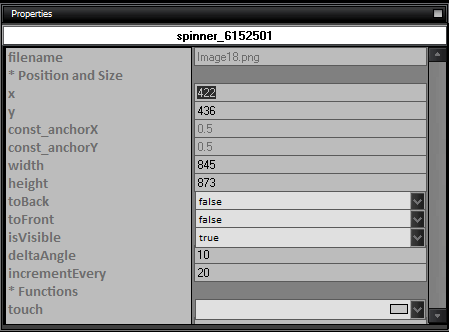


  • name: The name of the Spinner control.

  • Position and Size

    • x: The x-coordinate of the Spinner control.

    • y: The y-coordinate of the Spinner control.

    • const_anchorX: The anchor point on the x-axis.

    • const_anchorY: The anchor point on the y-axis.

    • width: The width of the Spinner control.

    • height: The height of the Spinner control.

    • toBack: Set to true to move the Spinner control to the back.

    • toFront: Set to true to move the Spinner control to the front.

    • isVisible: Set to true to make the Spinner control visible.

    • deltaAngle: The angle by which the Spinner control rotates when spun.

    • incrementEvery: The interval at which the Spinner control increments.

  • Functions

    • touch: The function to execute when the Spinner control is touched.