| Topics List |
| Design Elements |
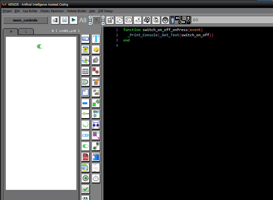
| Switch |
| Binary Selector: The Switch Control |
The switch control, often referred to as a toggle switch, is a binary selector used to turn an option on or off. It provides users with a clear visual indication of the current state, making it ideal for settings where users need to quickly and easily enable or disable a feature. The switch control is commonly used for settings such as enabling/disabling notifications, activating a dark mode theme, or toggling a sound on/off. Its simple yet effective design makes it a popular choice for enhancing user experience and providing intuitive interaction in app interfaces.
 You can download the project from the following link: Class_Rar_0__38.rar Switch´s PropertiesDuring design mode, you can assign the following properties and events to a Switch: 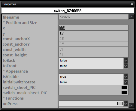
|