| Topics List |
| Design Elements |
| Radio Button |
| Selecting Options: Using Radio Buttons |
Radio buttons are a type of input control that allows users to select a single option from a list of predefined choices. They are typically used in forms and surveys where users need to make a single selection from a list of options. Radio buttons are designed to be mutually exclusive, meaning that selecting one option automatically deselects any other selected option in the same group. This behavior makes radio buttons ideal for situations where only one option should be selected at a time. By using radio buttons in your app, you can provide users with a simple and intuitive way to make selections, improving the overall user experience.
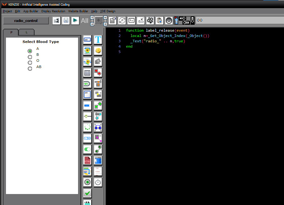 You can download the project from the following link: Class_Rar_0__41.rar You can observe the project in motion here: Radio Button´s PropertiesDuring design mode, you can assign the following properties and events to a Radio Button: 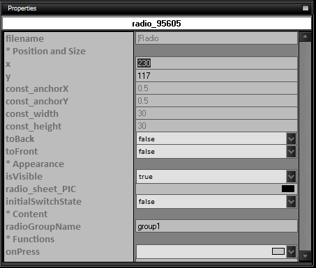
|