| Topics List |
| Design Elements |
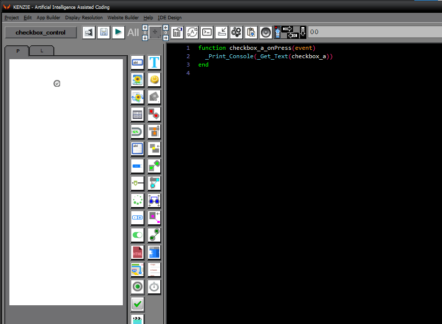
| Checkbox |
| Making Multiple Selections: Checkboxes in Action |
Checkboxes are a type of input control that allows users to make multiple selections from a list of options. Unlike radio buttons, which allow only one selection, checkboxes allow users to select multiple options simultaneously. This makes checkboxes ideal for situations where users need to select more than one option, such as when choosing items from a list or specifying preferences. By using checkboxes in your app, you can provide users with a flexible and efficient way to make selections, enhancing the usability of your app.
 You can download the project from the following link: Class_Rar_0__42.rar Checkbox´s PropertiesDuring design mode, you can assign the following properties and events to a Checkbox: 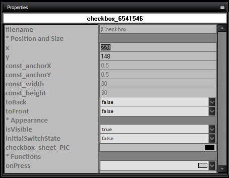
|